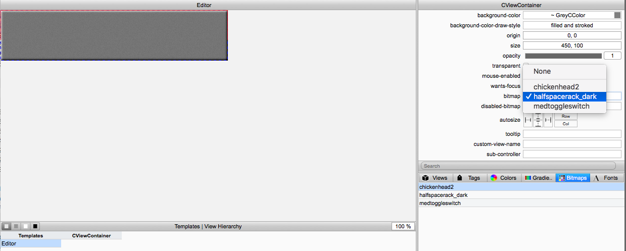
With the control ID (tag) values setup and the graphics files imported into the XML file, we can now assemble the GUI. First, let's set the background graphic for the editor template. With the editor template selected, click the "bitmap" box and choose "halfspacerack_dark" and the background will change to a beveled dark grey 1/2 rack space panel:
Next, switch the panel in section D of the GUI Designer to the Views tab (the first one) and you are looking at a list of all of the C++ GUI objects in VSTGUI4. You click and drag a row out of this list up on to the canvas. A red outline box will appear around the control, or around the space that the control will occupy if it has graphics. Let's set up the Volume knob control first. Drag an instance of the Label on to the canvas:
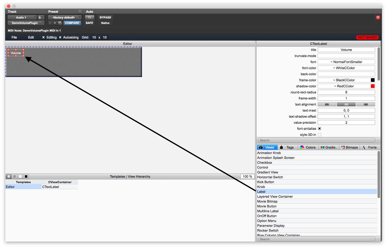
Then, set the attributes in section B of the GUI Designer. Set its title to "Volume" and then set the attributes according to these figures (or, however you like - you are in control at this point so you can choose colors, transparency, frame (an outline around the text), etc...) and experiment with the various settings of the attributes. This text label sits alone and does not need a control tag link value. For the example plugin, we made the following tweaks to the label attributes:
• font: ~NormalFontSmaller
• back-color: None
• transparent: checked (on)
• style-no-frame: checked (on)
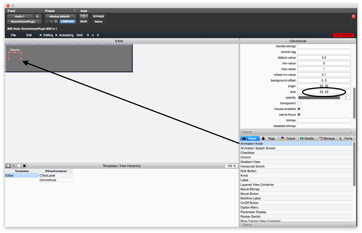
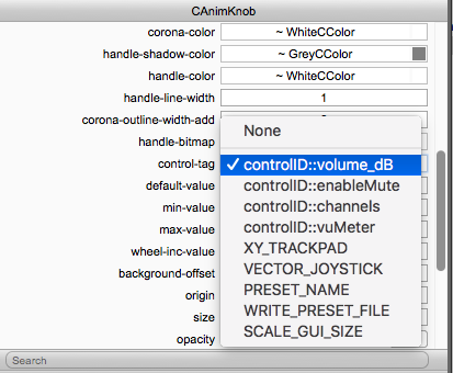
Next drag an instance of the Animation Knob on to the canvas and set its dimensions to 42, 42 as shown here - note that the GUI control is empty, with a red outline around it (don't worry if the full outline does not appear, as happened here):
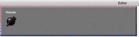
Now, click on the bitmap attribute and select chickenhead2 from the list:

And now the graphic will appear on the canvas:
You can now connect the knob to the control ID value that will eventually link it to the same PluginParameter object you declared in the plugincore.cpp file so click on the "control-tag" box and select the proper control ID (tag) from the list:
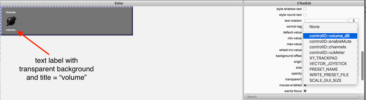
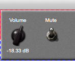
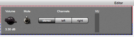
Next, drag a Text Edit control on to the canvas and place it below the knob. This control has numerous attributes (maybe more than any other control) and is highly customizable. We are going to link it to the same volume control ID (tag) as the knob so the two will work together. With the edit control, the user can manually enter an exact value in dB that the knob might have difficulty getting exactly correct. For the sample plugin, we set the font to be a bit smaller and set the background color to "None" and choose "style-no-frame" to remove the outer frame. Feel free to customize this control as you like. Then, link it to the controlID::volume_dB tag just like the knob. Your GUI should look like this:
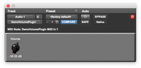
At this point, let's save the GUI and check its operation. Use File -> Save to save the XML file, then File -> Close Editor to shut down the GUI Designer. Due to the way the XML file is saved in XCode on MacOS, your GUI should automatically show up and function properly. In some DAWs and in Windows, you will usually need to close the DAW and re-compile the plugin, then re-open the DAW and load it. Some people like to do this always as a rule, regardless of the platform, to make sure the GUI is operating as expected. Your new GUI should display the knob and edit control, and they should change values together:

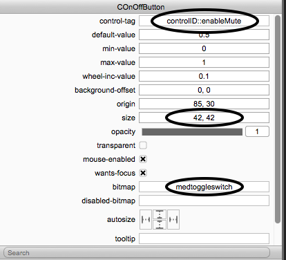
Now, let's continue the GUI by adding the mute label and button (switch). Open the GUI Designer again (shift + right click) and drag a label and an on/off button on to the canvas. The label should say something like "Mute" and you need to set the control ID (tag) and graphics dimensions for the on/off button as follows:
• size: 42, 42
• bitmap: medtoggleswitch
• control-tag: controlID::enableMute

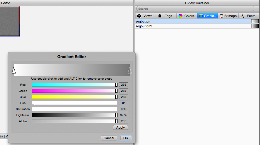
The segment button can use another kind of graphical device called a "Gradient" and you can create and build gradients within the GUI Designer on the Gradients tab in Section D. I've created two different gradients named segbutton and segbutton2 to use with the segment button control. One is lighter and the other is darker - it will take some practice to get used to editing the gradients which include any number of color-stops to define color transitions.
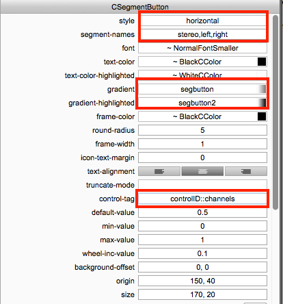
Now drag a Segment Button control on to the canvas and set its attributes as follows:
• style: horizontal (you can also play with the vertical setting)
• segment-names: stereo, left, right <- note that these match the same three strings we set up in the PluginParameter
• gradient & gradient-highlighted: choose the two gradients, or leave blank if you like - plenty of room for customization
• control-tag: link this with controlID::channels

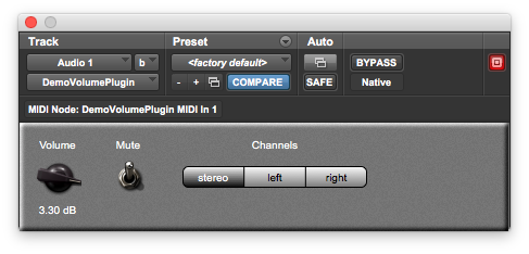
Save your work and close the editor window. Then, rebuild and reload the plugin (if needed) and test the new GUI. If you've connected the control IDs (tags) correctly then your plugin should now work as expected with volume control, mute, and channel selector.
Next, add a label for the VU meter and place it on the canvas (try using Edit -> Copy and Edit -> Paste to copy existing labels that will inherit their visual settings). Then, drag a VU Meter object on to the canvas and set its attributes as follows (note that there are two bitmaps):
• off-bitmap: vuoff
• num-led: 65 <- this is the same as the height of the graphic in pixels to make a solid VU meter
• orientation: vertical (can also use horizontal, but will require new graphics files)
• control-tag: link this with controlID::vuMeter
• size: 15, 65 <- this is the same as the graphics file dimensions • bitmap: vuon
Your GUI and attributes should look like this:

Save your work and close the editor window. Then, rebuild and reload the plugin (if needed) and test the new GUI. You will notice that the VU meter does not behave very well, and only barely lights up. This is because we are using the stock VSTGUI VU meter control.

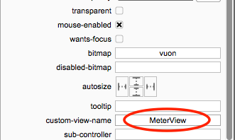
Your ASPiK projects come with several built-in VSTGUI4 "custom view" objects (custom views are an important design paradigm within VSTGUI4 that allow you to override the visual appearance and behavior of stock objects). One of those is called MeterView and you can use it by specifying its name in the VU meter object's custom-view attribute:
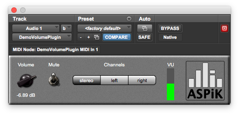
Save your work and close the editor window. Then, rebuild and reload the plugin (if needed) and test the new GUI. You will notice that the VU meters behave logarithmically with an attack time of 10 mSec and a release time of 500 mSec, which we set up when we created the PluginParameter object in the plugincore.cpp file. You might want to experiment with changing these values to play with the meter ballistics. The MeterView custom GUI control object will automatically bind to the PluginParameter properly to use its settings for calibration and ballistics.

We still have a little bit of real-estate left on the GUI on the right hand side so we can add a logo. Our logo is encoded in the XML file already and is not part of the ASPiK bonus graphics files that accompany the projects. To add a static graphic, follow these steps:
• import the logo graphics into the GUI designer
• drag a View Container on the Canvas
• set its dimensions to match your art file (our logo is 80 x 82 pixels)
• select your logo graphic as the bitmap
Our completed GUI is now fully functional; it looks great and works properly!