The GUI designer is divided into four regions labeled A, B, C, and D in the figure below. These four workspace areas are detailed here. In addition to these details, you should spend some time poking around the File and Edit menu items and get familiar with them as well.
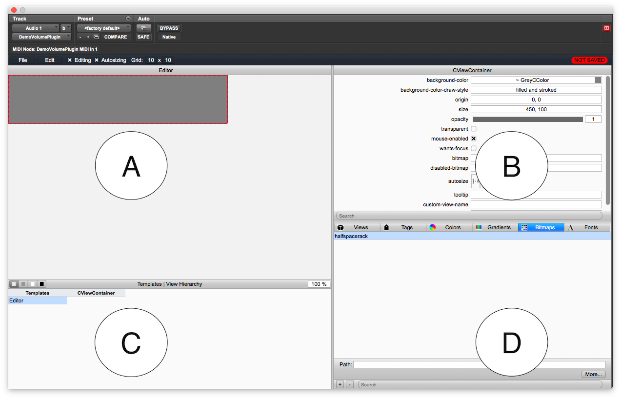
A. Template Designer
This is the canvas for your GUI designs. You will drag and drop GUI controls on to templates you create. Your GUI will come with the Editor template already in place. You use the Edit menu’s selections to manipulate templates including creating, destroying and copying them.
B. Control Attributes
Each time you select a control in the template designer pane, its attributes will appear in the attribute pane. The selected control will have a red dotted line around it. The name of the C++ object will appear in the title bar of the attributes pane. The attributes will be listed below and you will manipulate them accordingly.
C. Templates and View Hierarchy
This area lists the various templates in your GUI alphabetically. When you start a new project, there will be only one template listed – the Editor. As you add more templates and group or embed them together, the hierarchy of sub-view containers will be listed. The children of each view container will be listed in the CViewContainer column. When you double click on a child object, it will be highlighted in the Template Design pane and its attributes will appear in the Attributes pane. This goes for all children objects including views, sub-views and controls.
D. Views, Tags, Colors, Gradients, Bitmaps and Fonts
This pane contains a tab controller that allows you to select a GUI design element. The tab controller that you see that lists “Views, Tags…” with icons next to each one is actually a CSegmentButton control that has been customized with icon images!
Views
This tab contains a list of all the view objects in VSTGUI4. You will select a row in the list with the control you wish to place by clicking on the row. While holding the mouse button down, drag the row up into the Template Designer pane. When the mouse enters the template designer, you will see the control appear or you will see an empty rectangle that will house a control that requires an external graphics file. Once you’ve indicated the proper graphics file to use in the Attributes pane, the control will become visible. You cannot edit the Views list.
Tags
This is where you will define your tag names and enumeration index values. These may be any integer value, negative or positive, and the tags do not need to be zero-indexed. We will add the tags now for each control, but we will not connect them up to the plugin core until the next chapters. To add a tag, click on the “+” button at the bottom of the pane. This adds a new row to the list. You then name the tag in the first column and then assign a unique index to it in the second column. The “-“ button will delete a selected tag. You may name the tags however you wish; however their numerical index numbers must match the controlID values you define for your plugin parameters in order for the GUI controls to affect the plugin parameters.
Colors
This control lets you create colors. Two colors have been defined for you in the empty project template – a light grey and a dark grey color. These colors are used in the basic CSegmentButton design. You can blend and save all the colors you wish for your GUI here. Click the “+” button to add a new color and the “-“ button to delete one.
Gradients
A gradient is a color that morphs between two or more colors or shades. The colors morph from the left to the right in the designer window. You can create or edit gradients using the buttons at the bottom of the pane. You add color stops to the editor and drag them to define the color morphing start and end points. Gradients are used mainly for CTextButton and CSegmentButton controls. Your empty plugin project has two gradients defined that use two colors, and two more that are only a single solid color. You may use either set in your button designs, or you may create your own. When used properly, gradients can give the GUI a modern and polished look and feel.
Bitmaps
In VSTGUI terminology, a bitmap is a graphics file. VSTGUI uses PNG files so the term “bitmap” is not to be taken literally as the Windows .BMP file type. We will use PNG files exclusively. You add and remove PNG files using this control pane. When you add files, the image data will be stored in the XML files and when you remove them, that data will be deleted from your XML file. Usually one of the first steps in GUI design is to import all the graphics files you will be using first, then assembling the GUI next. Of course you may add or remove graphics files at any time during the GUI design process.
Fonts
You can add Fonts to your GUI design using this control pane. However, you need to be careful with this. If you add exotic fonts that are not normally installed in Windows or MacOS, then you will need to package these fonts along with your plugin when you deliver it to your customers. Typically, you make an installer to install the fonts along with your plugin. We will be using stock fonts for all of our plugin GUIs. This will simplify our designs and free us from needing to ship font installers with the plugin.