CSegmentButton
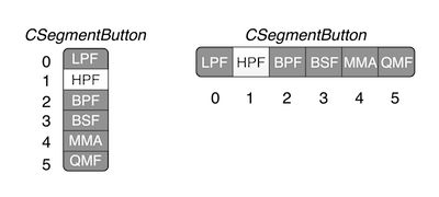
The CSegmentButton object (called Segment Button in the GUI designer) implements a vertical or horizontal bank of radio-buttons. In a bank of radio-buttons, only one button may be depressed at a time. This control delivers unsigned integer values corresponding to the various buttons. In a vertical segment button control, selecting the top button delivers the value zero (0) and the index values increase as the buttons move down the control. In a horizontal segment button control, selecting the left button delivers the value zero (0) and the index values increase as the buttons move to the right in the control. These are depicted in the figure below.
The CSegmentButton object paints its buttons with either solid colors or color gradients. A color gradient morphs across two or more colors over the span of the control and gives a modern look and feel to this control. This object is highly customizable with optional button graphics files and it can also display icons along with the text. You can find examples of customizing this object at www.willpirkle.com. The buttons have two states: normal and highlighted. The highlighted state represents a selected or depressed button. You typically use alternating light/dark colors or gradients for the two states.
When you setup a segment button object in the GUI designer, you will drag and drop a CSegmentButton object onto the canvas. You will then need to set the following parameters in the control’s attribute fields:
• segment-names: a comma separated list of text strings, one for each segment (button) – the control will automatically make as many buttons as there are comma separated strings in the list
• style: vertical or horizontal
• text-color: color of text on un-selected button
• text-color-highlighted: color of text on selected button
• gradient-color: color of the background of an un-selected button
• gradient -color-highlighted: color of the background of a selected button
• frame-color: color of the outer rectangle (frame) around the buttons
• frame-width: width of the frame in pixels
• round-radius: rounds the corners of the frame
• control-tag: the controlID value that links this control to a plugin parameter