CKickButton and COnOffButton
The CKickButton and COnOffButton objects encapsulate the momentary and on-off hardware button/switch styles. These are called Kick Button and OnOff Button in the GUI designer. Both objects use the same graphics file format.
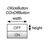
The figure on the left depicts a graphics file for either of these objects. For this example we observe:
• The width is the width of the graphics file in pixels
• The height is the height of a single button image in pixels
• The image of the button in its OFF state is at the top, while the ON state image is just below it
When you setup either of these controls in the GUI designer, you will drag and drop a CKickButton or COnOffButton object onto the canvas. You will then need to set the following parameters in the control’s attribute fields:
• size: the width, height pair separated by a comma (e.g. 60,20)
• height-of-one-image: the height value only (e.g. 20)
• bitmap: the name of the PNG graphic file associated with the control
• control-tag: the controlID value that links this control to a plugin parameter